
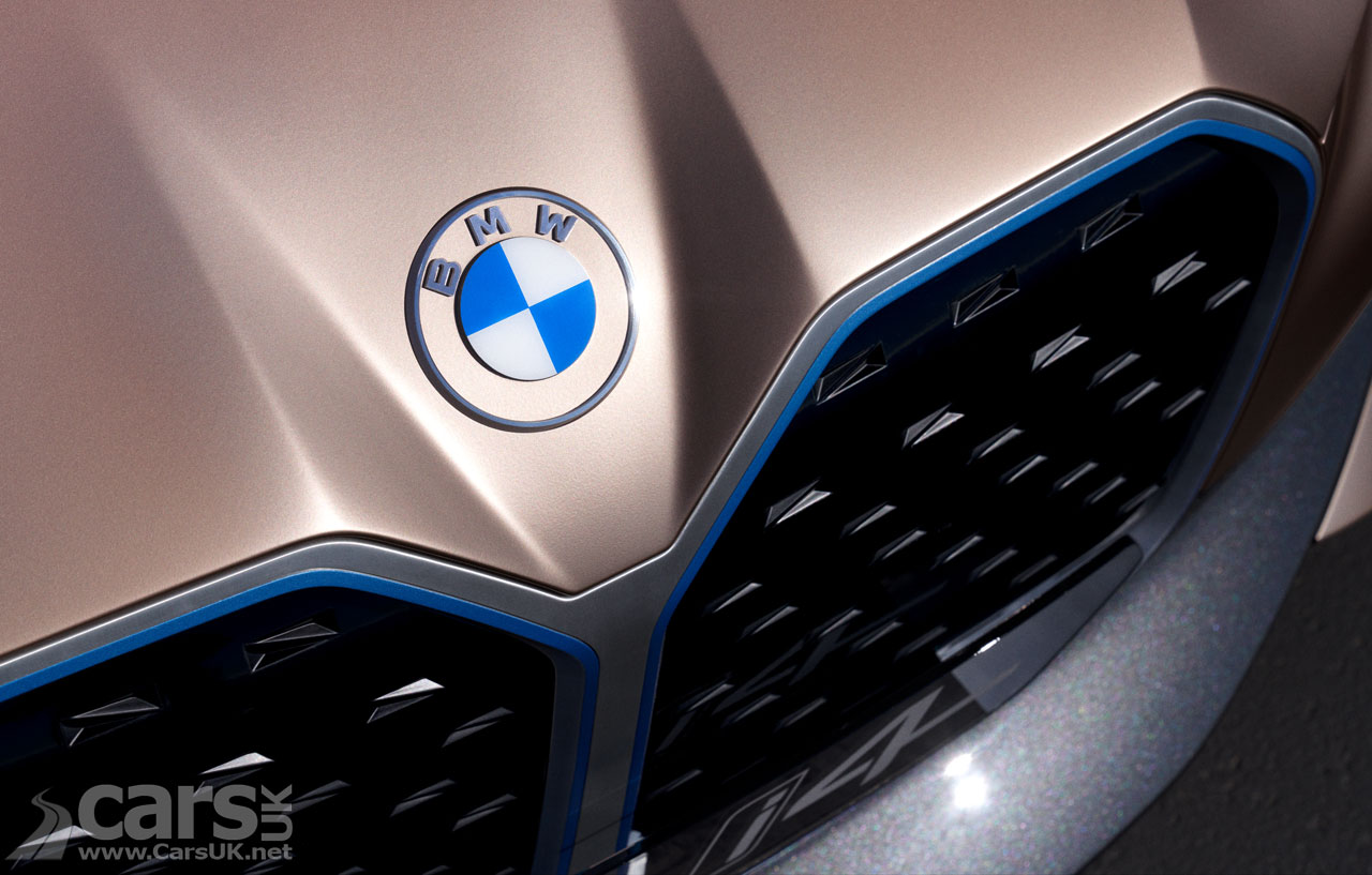
BMW Concept i4 new logo
The arrival of the BMW Concept i4 this week reveals BMW’s new ‘Communication’ logo, but it appears to be an old logo, rather than new one.

But it wasn’t just the arrival of the future i4 in Concept guise which was news, so too was the logo on the nose of the i4.
Now we all know that BMW’s logo is a ‘Propeller’, don’t we? Well, we do, but we’re wrong; it’s actually really just a representation of the style and colours of the State of Bavaria’s flag, and the idea of it being a ‘Propeller’ arrived from an advert BMW did in the early days for an aeroplane engine. Not that BMW has done much over the years to put us right.
It would be madness to drastically change a basic logo which is so well known, so BMW has taken the current logo – with its rather 1990s drop shadows and gradients – and replaced it with a flat, modern, two-dimensional version on the i4. And that’s a logo BMW will use going forward for communication (and, we assume, concept cars) but say they have no plans to use it on production cars. Which is a bit of a shame.
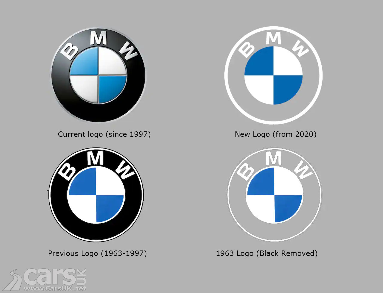
But, as they say, there’s nothing new under the sun, and that if you wait a while fashions will return, so we hope BMW hasn’t spent too much time and money on their new logo. Because they already had it in the history cupboard.
Below are the current BMW logo, the new logo, the 1963 BMW logo and the 1963 logo with the black removed.
Let’s hope that’s how BMW came up with their new logo.

Have your say - leave a comment