Ahead of a first look at its new electric GT, Jaguar reveals new branding to appeal to a more upmarket clientele.
We all know by now that Jaguar is in the throws of reinventing itself in a desire to copy the success Range Rover and Defender enjoy with a product which, despite many ongoing negatives, appeals to buyers’ hearts rather than minds and delivers product which despite flaws garners big sales and profits.Jaguar’s route to this utopia is their Reimagine plan for a trio of high-end electric vehicles aiming at a similar market space to Bentley, and despite a storied history they’ve decided to dump pretty much all that went before in the quest for a new identity.
Now, because this is 2024, Jaguar is revealing the new branding before we see any product, with JLR’s Chief Creative, Gerry McGovern, saying:
Jaguar has its roots in originality. Sir William Lyons, our founder, believed that ‘A Jaguar should be a copy of nothing’.
Our vision for Jaguar today is informed by this philosophy. New Jaguar is a brand built around Exuberant Modernism. It is imaginative, bold and artistic at every touchpoint. It is unique and fearless.
This is a reimagining that recaptures the essence of Jaguar, returning it to the values that once made it so loved, but making it relevant for a contemporary audience. We are creating Jaguar for the future, restoring its status as a brand that enriches the lives of our clients and the Jaguar community.
There’s lots of gobbledygook in the statement – and even more buzzwords – but ahead of the electric GT‘s first appearance on 2 December all we have to judge it by is the new four-part branding which Jaguar says “begins its unveiling today with an all?new brand identity that establishes its unique character, through a dramatic new visual language”.
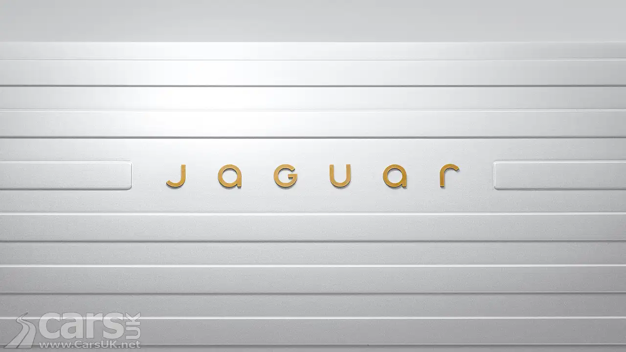
New Jaguar Device Mark
The new Jaguar Device mark (pictured at the top) is what we guess you’ll see emblazoned on the back of the new models, displaying a new Jaguar font which is very simple and geometric which, for some reason, has a capital ‘G’ amongst all the other lowercase letters.
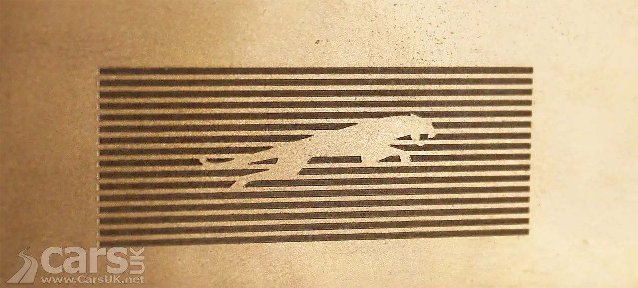
New Jaguar Leaper
Jaguar hasn’t dumped every aspect of its identity as it’s managed to retain the leaper on a background of strikethrough lines (below)

Jaguar Exhuberant Colours
Jaguar says of their colour palette:
Exuberant use of colour is a cornerstone of Jaguar’s new brand identity, embedded in its values and its association with art. Primary colours, born from the painter’s palette – yellow, red and blue – are the tonal building blocks, always presented with texture or movement.
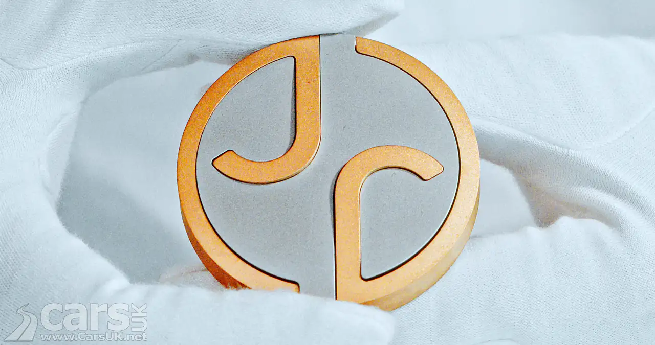
Jaguar Makers Marks
The new makers mark, which will pop up in designs (perhaps in the centre of wheels?) consists of the new font letters ‘r’ and j’. Although we’re not sure we’d have worked that out if Jaguar hadn’t told us.


Rod Hollingsworth says
Jaguar have first and foremost always appealed to the eye. From the Swallow sidecars, Swallow Austin Seven, through the SS saloons, SS 100, XK,s,MkV, MkV11, Mk1 and Mk2 ,XJ etc. etc.Lost identify with later saloons and SUV,s. F Type last real Jaguar. The new cars I understand will be again recognisable as Jaguar of which I am really looking forward to seeing.Having once owned a MkVll with that great XK engine,I was astonished that you are going 100% EV.This will be the biggest mistake Jaguar ever made. Having spent 42 years in the Motor Industry in sales, marketing and product planning(I was also a member of the European Product Planning Group) I now look at Most Manufacturers having second thoughts on the Net Zero date and governments being pressured to extend dates. Despite my thoughts I wish the very best to the brand that excited generations.
markageller says
Loved all but the new “medalion” . Can’t wait to see the vehice.